|
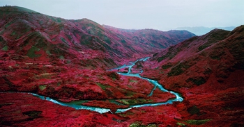
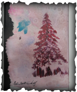
This art on the right is what my art was inspired by. I really enjoyed the vibrant colors so i decided to paint a pine tree which turned out very well in my opinion. I used the colors of the mountains to do it. The i layered water color paint in the background which looks very cool across the acrylic paint. Then while it was drying i dabbed my finger in the background for an extra texture. I also took a big layer of blue paint in the back to at the small amount of blue in the picture. To get the cool tear affect i had soaked the paper and tore.
0 Comments
This is apart of my observation project... I looked at a green apple and we were told to create a still life of pastel. The original outcome was the green apple in the bottom right of the portrait. Then i was looking at Andy Warhol and I've always loved is work and so i decided to layer the original image with pastel and i did the colors opposite on the color scale. All in all i think it turned out very well: 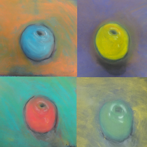 My goal was to make this image coming out looking like the fish and not putting too much pain on the fish. I went for an old black pain photo so to say so yeah there yeah go. In all i think i got the exact outcome i wanted.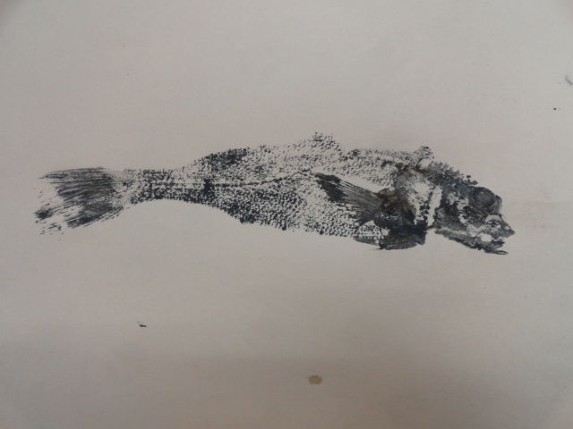 |
CalvinF.Enjoys almost any kind of art.Enjoys Drawing mostly.
Categories |
 RSS Feed
